Tokyo first appeared to me as a confusion of bright lights and unintelligible sounds. It was the fall of 2024, and I had just moved from London, now getting used to the first few sweaty, awkward weeks at the dorm for my language school. The building was in Fuchu, a city far west of downtown Tokyo but still within the borders of the sprawling metropolis.
I was working the route to-and-from college into my muscle memory, becoming sensitive to the corners, signposts, staircases and escalators of the Keio line entrance of Shinjuku station, the idle passing of the 45-minute non-time on the express into the suburbs, the silver train emerging from the tunnels just west of Chofu and rising from the ground onto the elevated tracks for arrival at Fuchu. I’d step out of the carriage and let the other passengers flow towards the exits so I could follow their path. Then, I’d step out of the gates and walk right, towards home.
In the first few months, as I became familiar with the walls and surfaces of my daily routes, I was shocked by the incredible rate at which the posters would appear and disappear. Perhaps it was just another expression of the Japanese fixation on efficiency and speed. At my local station in London, there were adverts that had remained in place for almost a decade, becoming unconscious waypoints for commuters like myself. Now, as I became aware of the constant churn of the station’s commercial surfaces, I was also becoming attuned to the fixed points in the environment— This is how I first came to notice the poster.
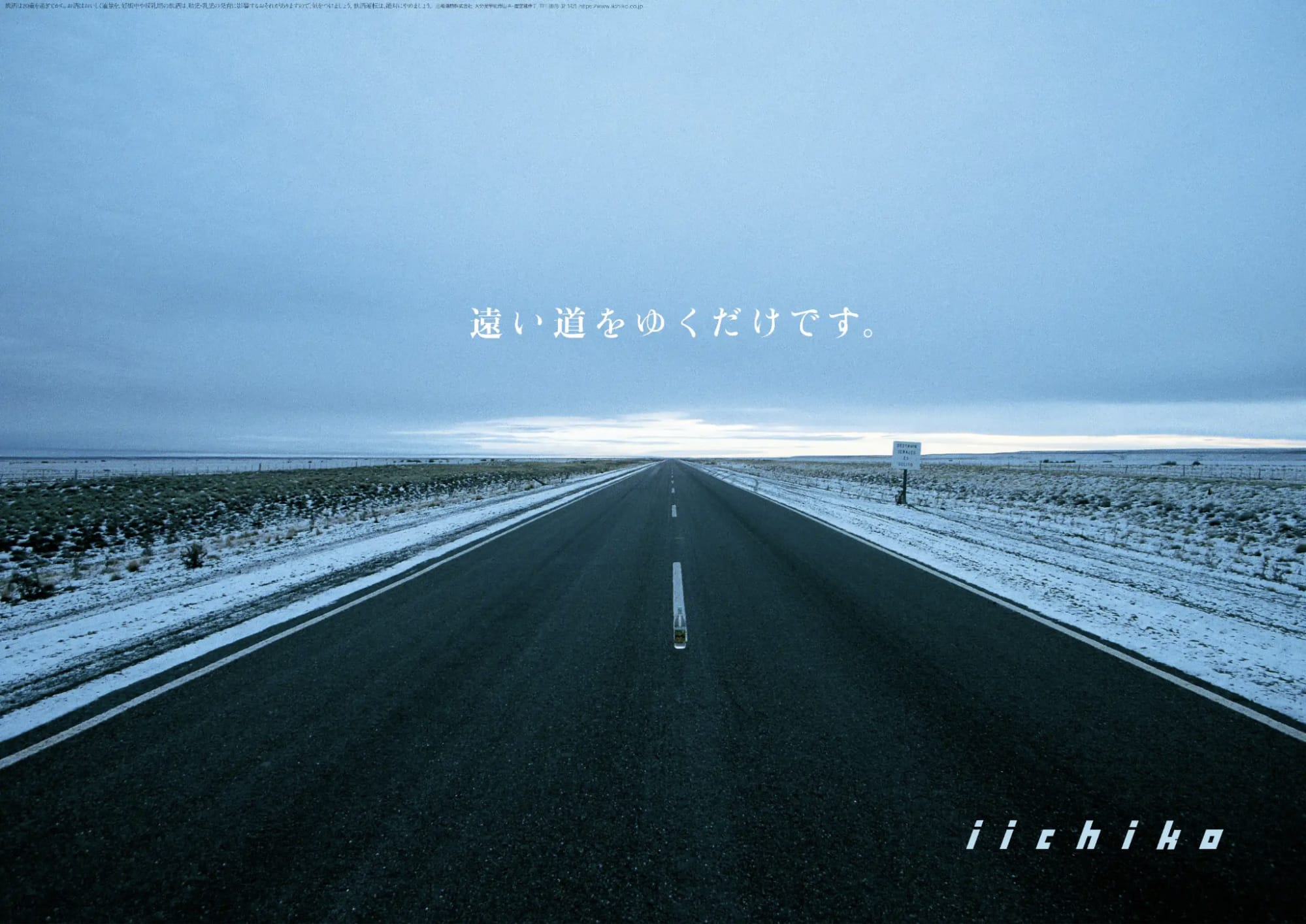
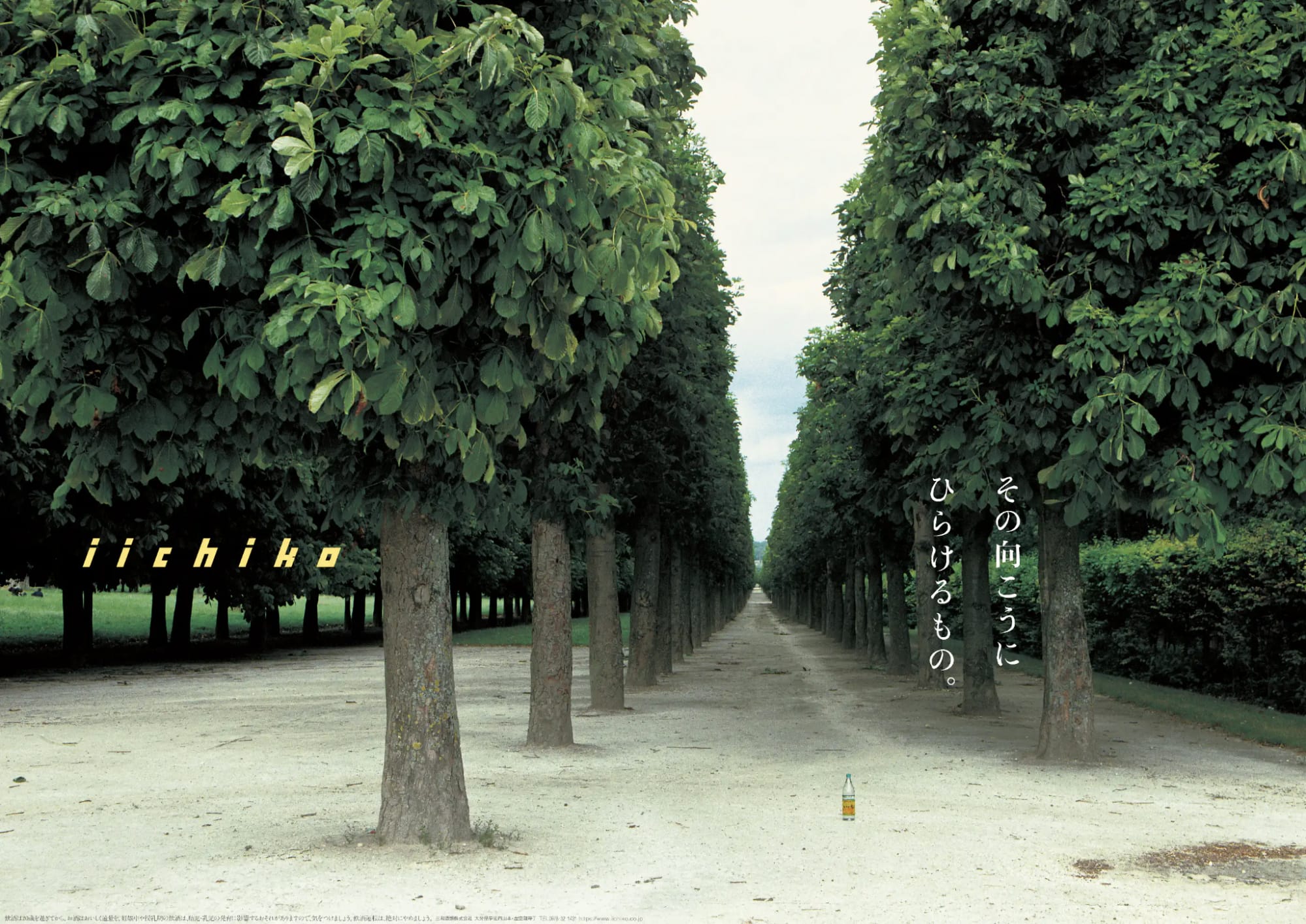
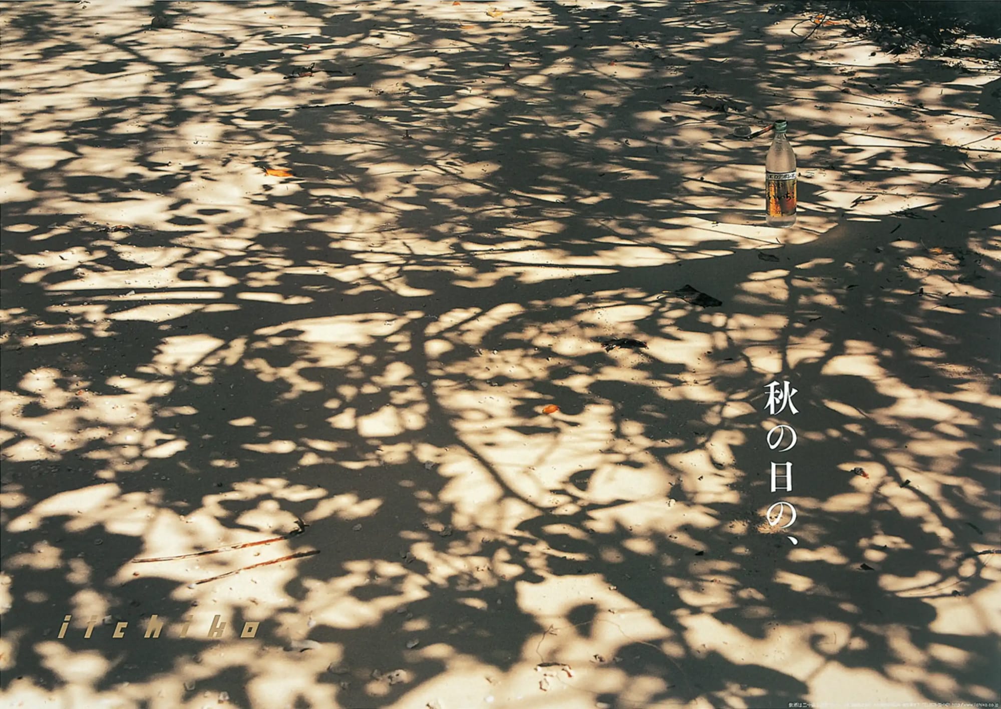
One day, wandering the less-explored part of the station to the left of the turnstiles— the opposite direction to my route home— I happened upon a poster that cut straight through the cacophony of its surroundings. At first, I wasn’t even sure if it was an advert or not, from a distance looking more like an out-of-place nature photo.
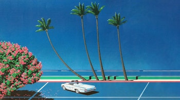
Two long rows of trees stretched far into the horizon, casting dark corridors of deep shadow onto the sandy ground. When I stepped closer, I saw that the grounds were empty, and the sky over-exposed. I could smell the trees. Not a person in sight. I noticed something and looked again. Sitting tiny in the frame’s expanse but unmistakable once noticed was a single glass bottle. At the moment I saw it, a yellow word-mark revealed itself from the trees: ‘iichiko’. To the right of frame was a short, cryptic phrase standing vertical among the trunks: その向こうにひらけるもの。“That which opens in the distance”, or maybe: ”What reveals itself from the beyond”
I’d make a point of spending time with the scene over the course of the month, trying to catch another glimpse of its impossible sensation before its impending replacement with something meaningless and loud.
To my surprise, while all the other posters in its surroundings were exchanged and discarded, this faceless scene of trees and shadow remained untouched. It became a small piece of solace within the whirlwind of adaptation to a new country, new city, new language, new home. Everything in my life was in a state of overwhelming change, so I clung fast to this little, unassuming moment of the familiar and imaginary.
And then, one day, it was gone.
My love affair with the scene had marked the last few weeks of December, before I set off for a short trip over new years’ vacation to visit a friend in Aomori. When I returned, I took a short detour to set eyes on my little scene— but it was nowhere to be found. Walking closer to confirm my fears, I was relieved to see that instead of being erased from existence, another scene had simply taken its place.
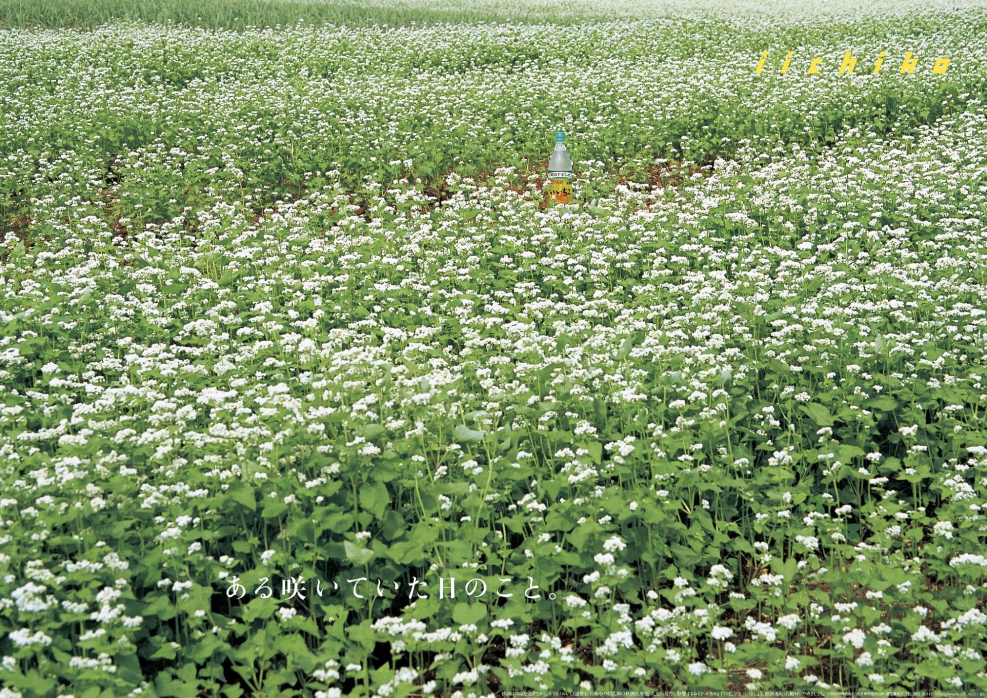
In the new poster, powdery white flowers dotted diagonal lines into the distance, dancing like light snow over a field of verdant green. The sky was cropped just out of frame, the dots of petal blending into a mass of speckled white and sloping boundlessly upwards towards an invisible horizon. At the top right, almost unreadable in light yellow over light green: ‘iichiko’. Tiny in frame, sitting just on top of a row of flowers was another bottle. At the bottom, another cryptic phrase. “ある咲いていた日” – “On the day the flowers bloomed”.
The campaign, which is directed by Hideya Kawakita, has been running uninterrupted for almost 40 years, producing a poster for every month of the year (and Christmas) since 1986.
Designer, Writer, Race-Car Driver
Born in Kurume, Fukuoka in 1947, Kawakita spent the spring and summer holidays with his brother-in-law, who worked at the breweries in Usa city. Helping with the delivery of shipments across Oita prefecture, he became familiar with the sake business, pickling vegetables in the brewery and playing with the owner’s son.

A self-confessed train lover, Kawakita would spend hours memorising timetables, and could even recite the names of every station between Kagoshima and Tokyo by heart— by my calculations, a total of roughly 400 stations, depending on route.
Entering his first year of high school, Kawakita had a decision to make: Which of his passions would he pursue? Until now, his attention had been captured by three seemingly unrelated professions: Design, Journalism, and Race-Car driving. Although seemingly disparate roles, Kawakita explains in an interview for Sanwa Shurui’s Koji Note that he considers the three alike:
“In my opinion, the three are the same. As a Designer, you observe facts closely to comprehend the subject, and then create a solution to fit. A journalist takes the same information and forms it into an article. A Race-Car Driver may seem pretty different, but is actually similar. He must navigate the course with precision, and at incredible speeds. You can’t overlook a single pebble. In this way, they are just like Designers or Journalists. You cannot overlook the truth.”
In the end, posters for the 1964 Tokyo Summer Olympics catalysed Kawakita to commit to design, and he went on to study at Tokyo University of the Arts. As a new transplant to the capital, he discovered the difficulty of understanding the existing map of the Metro system at a glance. Between school hours and part-timing at various printing companies, he worked to devise a new, easy-to-understand map with the intention of presenting it as his graduation project.
Eventually completing the map a year after graduation, he presented it to the Subway Mutual Aid Organisation, who offered to distribute it in stations on the condition that he find an advertiser himself. In the aforementioned interview with Koji Note, Kawakita reflects that the stipulation was probably an attempt to gently decline. Regardless, Kawakita was able to secure sponsorship, and the organisation kept their end of the bargain. Versions of Kawakita’s map have been in use ever since.
Hot off the success of the map and generally disinterested in taking company entrance exams, Kawakita founded his own design studio Japan Belier Art Center in 1974, producing a series of etiquette posters for the Metro as their first major project. Years later, he was connected by his sister and brother-in-law with Sanwa Shurui Ltd., the manufacturers of iichiko shochu.
Shochu is a type of sake originating from Japan’s Kyushu region, differing from typical sake (nihonshu) in both its higher alcohol content and earthier flavour. Although predominantly made from rice fermented with koji mold, shochu can also be produced from ingredients such as barley and sweet potato.
At the time, Shochu was not widely consumed outside of the Kyushu region, and iichiko’s easy-to-drink flavour profile was Sanwa Shurui’s push for mass-market adoption. The company was seeking to create a new series of posters for display in liquor stores and Izakayas, which became the origin of Kawakita’s photo-centred campaign. Originally published once every two months, the campaign took off in popularity, adopting its current monthly station poster format in 1986.
The 80’s and 90’s saw a massive boom in popularity of Shochu, no doubt in large part due to iichiko’s accessible flavour and approachable communication. Today, the spirit is a staple of any Japanese bar. Beyond the posters, Kawakita has been the creative lead for almost all design and marketing related to iichiko since the spirit’s inception: everything from labels, bottles, promotional events and television advertisements fall under Belier’s purview.
Memory and Spirits: Encountering Japan beyond Japan
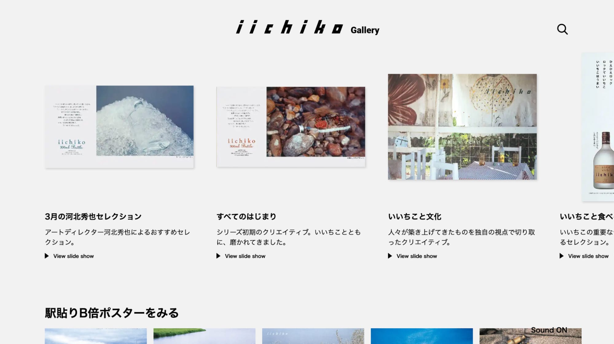
You can explore an archive of iichiko’s advertising at their special gallery website gallery.iichiko.co.jp, a noteworthy and all-too-rare example of a company preserving and publishing materials that would otherwise fade into disarray and obscurity. First created as a temporary feature for iichiko design week 2024, the gallery has remained live on iichiko’s website with regular updates. Taken altogether, what becomes clear is that Kawakita’s vision for iichiko is one of deep but unplaceable nostalgia.
Is it ironic for such a mood to apply to a drink that clouds the memory? Or is it exactly the fuzzy texture of a half-drunk recollection that conjures that emotion? Maybe the simplifying power of a strong spirit is what creates its sentimentality: the distillation of detail into an evocative but nonexistent memory, all the purer for never having been bruised by contact with reality.
Kawakita explains that this kind of placeless imagery is by design— Although the campaign’s aim is to create an unmistakable Japanese atmosphere, all photography is actually conducted overseas:
“One of the reasons that we photograph our campaigns abroad is that if you shot in Japan, the image would be cluttered by things like telephone poles and stakes, which are conspicuous. But, even though it’s shot overseas, it’s still Japanese scenery. What does this mean? It means that humans aren’t always seeing the true state of what they perceive.”
“When you walk around town, you’re perceiving a portion of your surroundings, but outside of your direct perception, your experience may be shaped by what you’ve seen on television, films, and in magazines. All of that is mixed together in your head. The idea of ‘Beautiful Japanese scenery’ is not actually something concrete, and we cannot put a finger on what it brings to mind.”
It’s easy enough to label something as ‘nostalgic’, but what do we actually mean by that word? All imagery in the campaign is contemporary, shot to match the month of distribution. Maybe it’s the emptiness of the scenery— the kind of environment that we might picture in our head without the specificity of a single, anecdotal memory. And it’s likely that over the course of the last 40 years, the posters themselves are now just as ‘nostalgic’ as the scenery they depict, a quiet but ubiquitous presence in the background of daily life.
It’s about time that I reveal that I’ve never tried a glass of iichiko. I think a large part of me feels too shy— or maybe a little too prideful— to admit how affected I’ve been by an advertisement. I suppose a love for the commercial surface is the preoccupation of almost everyone involved in design, tempered by varying levels of deflection in an effort to appear more savvy or discerning than the average consumer.
The unavoidable fact is that commercial design is a commercial service, regardless of any poetic vision. But I think another part of me has been resistant to condense the meaning of that poster into a tangible, glass-and-liquid form. And of course, I’d be a little heartbroken if I found that I didn’t like the shochu.
I moved away from Fuchu at the end of last year, and I haven’t seen an iichiko poster in my regular commute since then. I’m almost certain I’ve passed them many times, but an encounter is so fleeting that it barely registers, immediately absorbed into the semiotic maelstrom of downtown Tokyo. But I know that a little scene sits on a station wall somewhere in the western distance, renewing itself with the punctuality of a calendar. Somewhere in that scene sits a little glass bottle— the promise of revisiting a memory that doesn’t exist.
Explore the last 40 years of iichiko’s advertisement history at https://gallery.iichiko.co.jp/